My Telstra Help & Support
A digital support experience designed from the ground up, personalised to individual customer needs yet scalable enough to cater for millions of active users.
TEAM
Telstra Digital
ROLE
UX Designer
PLATFORMS
App & Web
DURATION
6 months
Nowhere to go but up
By late 2018, the Telstra 24x7 app had reached an active monthly userbase of 4 million customers - but the company was still struggling with digital Support. While the 2nd highest call driver/reason of the year was “Fixing a Fault” (behind only bill enquiries), less than 1% of transactions in the app were Support related.
There was a clear gap between the customer goals and what Telstra was currently providing, which was echoed in verbatim from the app store reviews, in-app feedback and social media posts.
“Contacted call centre to follow up a fault multiple times and given the merry-go-round. I’m fed up with the constant disregard for my time…”
- Call Centre log
“Hung up on after 2 hours and 10 minutes patiently on hold for help - complete bull**** Telstra”
- App store review
Solving the right problem with research
With the existing self service app and website over 7 years old, replacements were commissioned to meet these shortcomings, along with an entirely new design system. I joined the team at the very beginning of the planning process - and was tasked with designing the support experience.
My first step was research to better understand current day pain points - so that I could narrow the scope of the problem and focus on more than an obvious visual overhaul. I drafted a 2-step research plan, starting with a usability testing session to get key qualitative insights, and afterwards a quantitative online task to refine the IA and grouping.
Critical to this was recruiting the right people to test with, for which I referred to Telstra’s consumer segments. While confidential, these tend to skew older in age while still including a broad range of demographics and levels of digital literacy - it was helpful to keep this in mind throughout the design process.
User Testing #1 - Understanding Pain Points
I conducted 5 one-on-one interviews, which consisted of the following parts:
1. Background questions to understand the customer’s technology usage, typical behaviour during a fault and prior experience with Telstra support.
2. Short tasks using the live app and website - from attempting to resolve internet dropouts in the app to going through the troubleshooting and FAQ flows on the web.
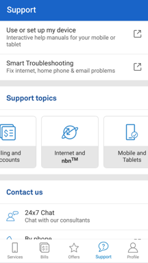
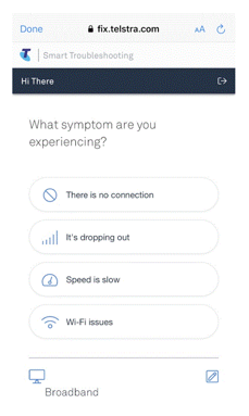
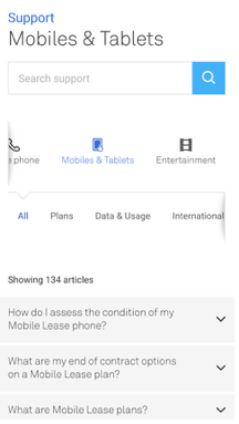
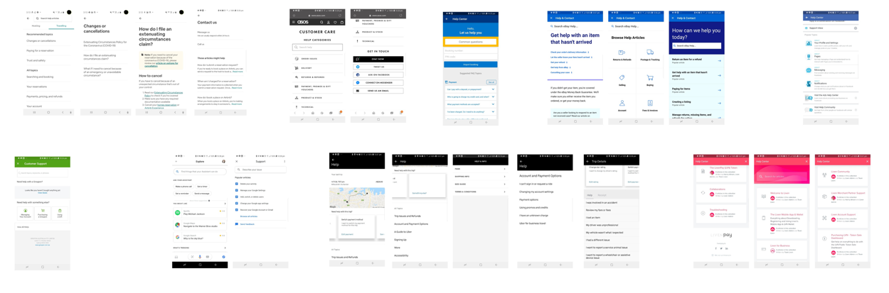
From left to right: the in-app Help page, web troubleshooting flows and FAQ articles
The findings were equally promising and challenging:
• Chat was decribed as the preferred channel to calling in, with less wait times
• Online troubleshooting or FAQ hunting was described as lengthy, often with no payoff
• The current help landing page had heirarchy confusion, an unclear first tap and was considered a ‘link farm’
Inspiration from Best Practice
I now had a solid idea of the areas new Help experience should focus
• A single and clear first action, logically grouped by product line or customer intent
• Prominent chat/messaging entry points
• Reduction of link-outs through native content
A thorough competitive analysis helped gauge how both Telcos and other industries were approaching this, and i began to notice a fairly consistent product based layout, often in large grid-based tiles. An interesting addition by the likes of Amazon and Uber was a contextual message at the top of the page, for example a recent order or past ride. There were obvious possibilities for such an ‘contextual alert’ with Telstra - for example a current outage - and I decided to host a workshop with the wider stakeholders to flesh them out.
Above: an excerpt of the competitive analysis, useful to play back to stakeholders in ideation workshops and also assisted with early concepts.
Workshop - Ideation and Prioritisation
Invited to the workshop were a broad range of stakeholders - from product owners to call centre managers to tech leads to other designers. The objective was to play back the research findings, rapidly ideate on the ideal experience and leave with a vision or set of principles we could all work towards. To do this I employed LUMA HCD methods [conducted online to suit all stakeholders], starting with abstraction laddering to hone in the real problem, moving into rapid idea generation, and finally prioritising the ideas based on Importance vs Difficulty.
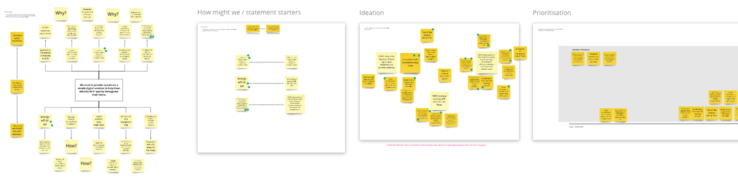
The session was a valuable learning experience, allowing everyone to contribute their expertise, and also getting immediate feedback on the infeasibility of an in-app search feature - which would take a year or more to properly implement. By its conclusion, when all the ideas had been clustered and prioritised, 3 design principles stood out which would guide the actual designs:
• Personalised
• Proactive
• Contextual
Wireframing the concept
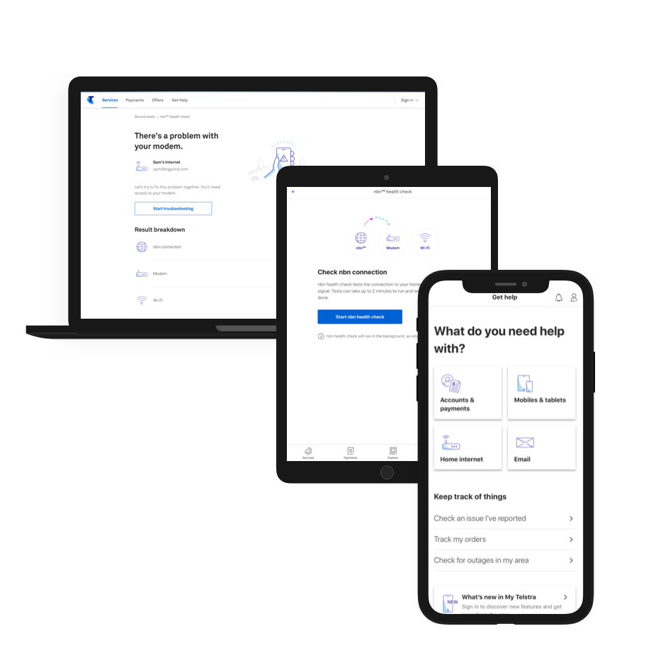
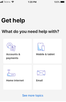
The resulting concept was streamlined around the large topics at the top of the page, but also proactively display information that was most relevant at a particular time - for example a scheduled outage. It was also personalised to only show help for products each customer actually had (e.g. mobile, NBN etc), removing the bloat. Finally, there were multi-step native flows rather than a ‘link farm’ front page, to guide users along and determine their intent.
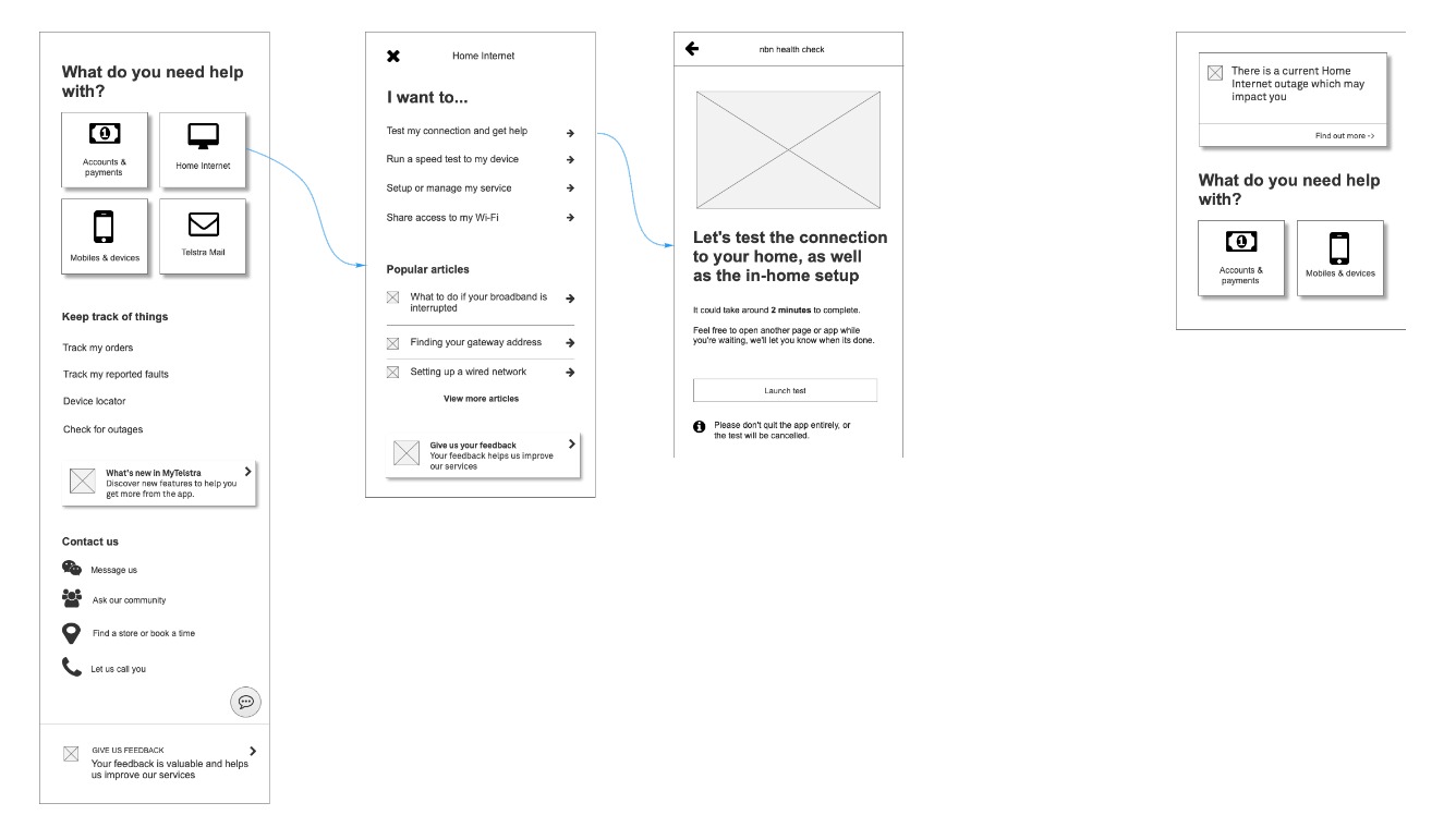
From left to right: the improved Get Help flow drafted in Axure, as well as a variant shown in the case of an Outage.
This was iterated and improved in our team’s weekly Design Critique, and some of the design patterns (e.g. the Product Tiles) were fed back into the Design System for the benefit of everyone.
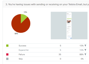
User Testing #2 - Nailing the IA
Now that the basic elements of the page were laid out, it was time for a second round of user testing to flesh out the details. For this, I opted for large scale quantitiative testing via Optimal Workshop, with more emphasis on data for decision making.
1. How users solve a task in the app and website, by recording the area they click on.
2. Follow up questions gauging their reasoning, and whether anything was not understood.
The results supported the decision to lead with product based categories, with the vast majority of participants able to click into e.g. ‘Mobiles & Tablets’ to follow up a question about international roaming. It also showed there was no issue with navigating multi-step drilldowns, which had been a concern of the product team.
Interestingly the results also assisted in choosing larger Tiles over a List layout, since the design with the tiles had a higher task completion rate. It also helped refine copy - with many users confused by the generic ‘Internet’ but more accurate when the label was ‘Home Internet’. These results were combined with live data from the current app to decide their final ordering on the page.
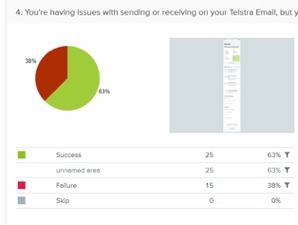
From left to right: a list based version with a low success rate, compared with a grid based version with higher success (task order randomised).
Accessibility and documentation
During this project I was undertaking accessibility training from Intopia and edX, and prepared focus order docs and screenreader labelling for the developers. In addition, since our QA team was untrained in the area, I also produced detailed documents on ‘expected screenreader output’ for Android and iOS which were widely shared with 50+ members of the design and dev teams.
A subtle issue with text resizing was encountered during the build and QA efforts - at over 200% text zoom of the Product Tile labels were clipped off. Working closely with our team’s visual designer Jack Doran, an ‘adaptive column’ solution was devised which could show the tiles in a larger single column layout for high zoom, or default to two columns for all other users. This was a great solution allowing development to continue with minimal delay, and still reach our target of AA accessibility compliance.
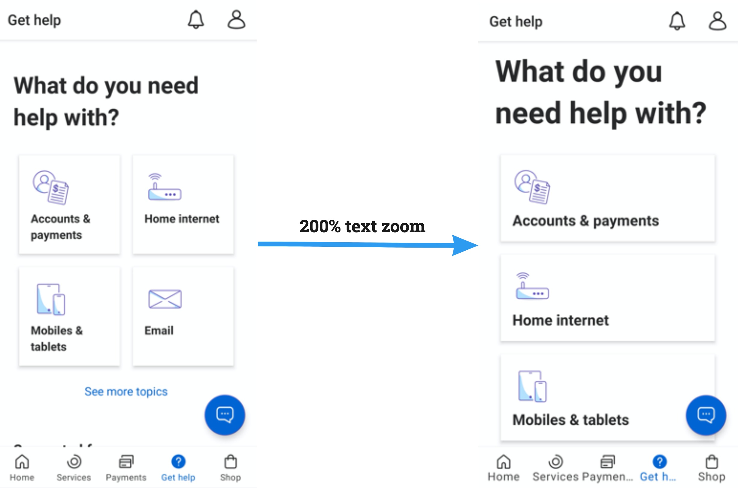
From left to right: the page at default text size, and at 200% text zoom on the same device
Mission accomplished
After release and launch in June 2019, we kept a close eye on the usage statistics to validate if we had successfully digitized Telstra’s support. After 2 months this became a resounding yes, with over 1 million unique monthly visitors to the Help page and 50,000 home broadband fault resolutions - many times higher than the previous app & website. There was also a dramatic dropoff in outage related calls due to the proactive alert in the app.
A more personal success was witnessing the scalability of the Help platform after launch, seamlessly expanding to suit to new products and flows. I remained the Support design lead for the app and website, and worked with a large variety of teams around the company to further create and deliver the north star vision.
Let's work together
Reach out at faris.ahmed1@live.com