Connected Home
A combined view of all the devices on a customer's home internet and multiple tools to improve their performance. Planned and designed together as part of a long term vision.
TEAM
Telstra Digital
ROLE
UX Designer
PLATFORMS
App & Web
DURATION
6 months
A tangled web
By early 2020, a world-class Support flow had been designed and launched, but it was still only the surface level of a deeper problem. Home internet faults were the most difficult to effectively resolve - due to the complexitities of the NBN and people’s differing wi-fi setups - and were becoming more critical to get right with the onset of COVID-19.
From ample customer feedback, NBN speed and wi-fi quality were not viewed as seperate factors, any speed issue was seen as Telstra’s fault. As the service provider, we had the responsibility of educating customers on ways to improve their setups and optimise what they were paying for - without lengthy FAQs or technician visits. I aimed to create a unified strategy centred on mobile-first flows, new tech and customer led design.
"Just upgraded to the highest speed plan and getting the same issues, absolute crap Telstra"
- Customer support forum
"Don't bother, the troubleshooting didnt fix anything and says everything's all good..."
- Usabilla website feedback
Designing for the future
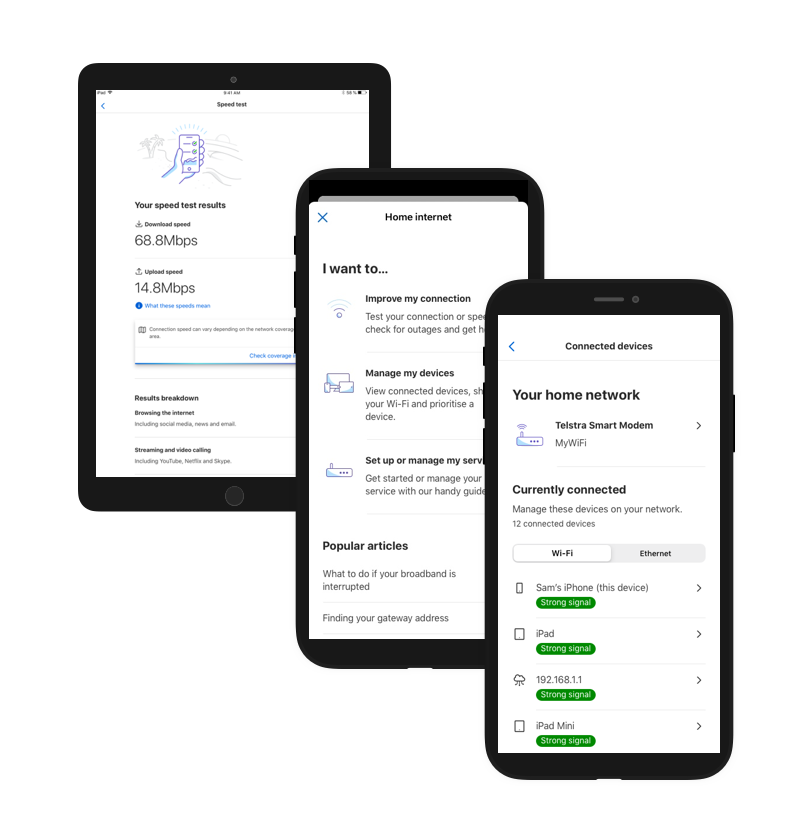
There was already a feature roadmap provided by the product team, my job was to maximise the value of each one, then figure out a cohesive way these pieces could all fit to address problems. The features in order of (estimated) delivery date were Speed Test and Wifi Quality of Connected Devices - but the ask was open ended beyond that. I had the hypothesis that the approach we had used for the Support page would not cleanly scale to fit these new features, and decided to rapidly prototype and test it.
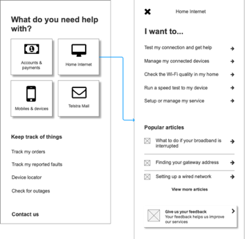
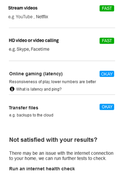
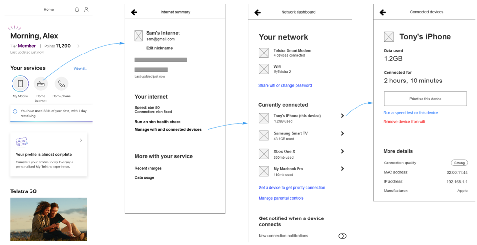
Starting to get messy - a quick mockup of what all features would look like added to the existing design. They each served a different purpose, but would customers know that?
Existing research and competitors
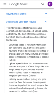
For the first design sprint, I focused on detailing Speed Test since it was the first feature slated for release, and also a very noticeable symptom in internet issues. Naturally in Telstra there was existing user research on speed tests which I could use a basis for improvement. Some of the key observations from these previous testings were:
• Customers needed more than raw numbers, but whether these were good/bad/normal (comparative measures)
• Customers wanted clear next actions, such as ways to improve speed or plan
• Terms such as ‘ping’ were confusing, even when described with additional text
With this in mind, I then compiled a thorough competitive analysis of examples by Netflix, Google, Ookla and more - to see they had differentiated themselves. While nearly all of these looked similar visually, Netflix stood out for its simplicity, Google for its detailed explanation of terms,, while Meteor stood out for a use case breakdown.
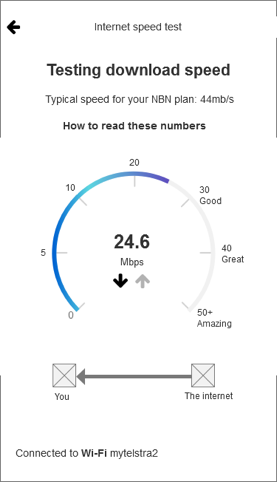
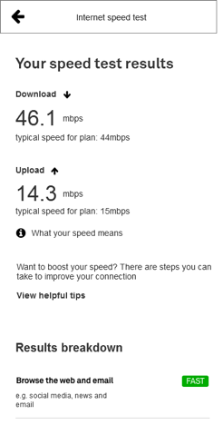
All of these elements were combined into a single testable prototype - along with one ‘secret ingredient’ that only an ISP could provide: a comparison of current speed to the plan that the user is paying for. It was now time to test.
User Testing #1 - Basic Flow and Language
Critical to successful insights from the user interviews was recruiting the right people to test with, for which I referred to Telstra’s consumer segments. While confidential, these tend to skew older in age while still including a broad range of demographics and levels of digital literacy - it was helpful to keep this in mind throughout the design process.
I moderated the 5 one-on-one interviews, which consisted of the following parts:
1. Background questions to understand the customer’s technology usage, experience with speeds, wifi and fault resolution.
2. Short tasks using an Invision prototype - from trying to get back online in a NBN dropout, to help with a speed issue, to resolving poor wi-fi coverage.
The key positives from the interviews were: basic flow as expected, breakdown by activities was helpful and clear next actions to improve speed.
However the key challenges identified were with entry points, with 3/5 customers confusing Speed Test with other actions on the Help page. The problem was compounded when customers attempted to resolve wi-fi issues, it was clear all the tests overlapped.
Detailed wireframes and accessibility
Going back to the drawing board, I came up with a new, multi-step entry point design that focused on distinct symptoms of issues. It was run through our weekly Design Critique session to optimise it, then improved further by visual designer Jack Doran through the use of iconography.
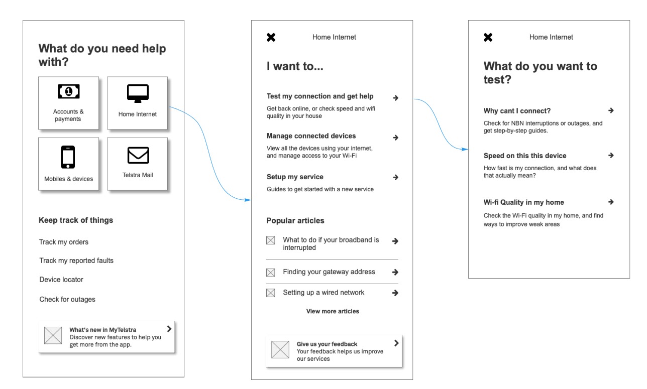
From left to right: the improved Troubleshooting flow, created in Axure and Miro
As ubitiquous as speed tests are, the accessibility features are surprisingly undeveloped - with few competitors providing updates via screen reader to reassure the user the test hadnt frozen. After online research, I proposed a solution of announcing the test starting, then having a ‘test running’ announcement every 10 seconds, and finally the results. After checking with an Intopia expert, this basic idea was retained, with some text shortened and replaced with a vibration and sound. It was a valuable learning experience - finding a balance between informing the user as well as not annoying them with constant voiceover.
Workshopping the North Star
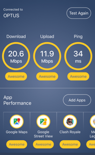
Now that the speed test was validated and refined, a larger project remained - a consolidated view of devices connected to a home modem, showing wi-fi quality and how to improve it. The hypothesis was this would boost the app as the ‘first port of call’ during an issue, tying together both wi-fi management and diagnostics such as the Speed Test in a logical way. A similar design process was used, starting with a competitive analysis of the market.
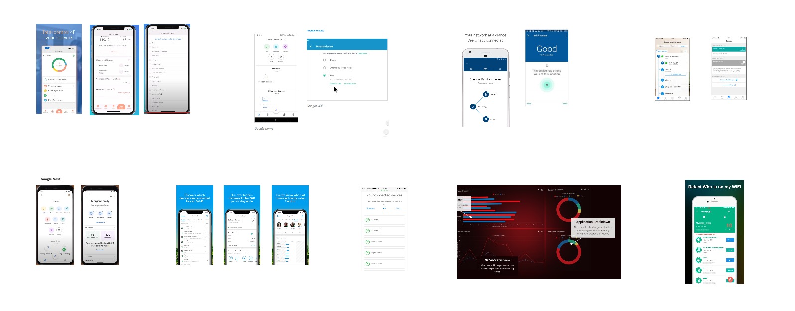
Standouts among those audited were Google - for a simple home wi-fi view, and Gryphon - for advanced features such as prioritising or disconnecting a connected device. While we knew not all these features would be possible for MVP, it was more important to establish a vision the team could work towards.
However just because our own team liked these concepts didnt mean they were feasible or even logical in a Telstra context. To find this out, I set up a workshop involving product owners from all sides of wi-fi fault resolution (call centre, in store etc), as well as technical experts and other designers. I setup a series of activities following LUMA HCD techniques, beginning with a problem tree analysis of poor wi-fi’s causes/effects and ending in generating + prioritising new solutions.
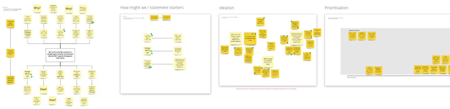
The workshop was an ideal way to tap into the breadth of knowledge existing in the company, see what existing work we could leverage and also create innovate new ideas. I created concepts based on the top themes: data usage + wi-fi strength for each connected device, as well as the ability to disconnect devices.
User Testing #2 - Nailing the IA
I moderated 5 user interviews remotely via Askable Live, which consisted of the following parts:
1. Background questions to understand the customer’s wifi setup, common issues and resolution behaviour
2. Short tasks using an Invision prototype - experience of resolving issues with poor wifi and speed (including both new concepts and the existing speed test)
Above: a sample of the flow that was tested
The results were encouraging, the changes we had previously made to the IA allowed the 4/5 users to find the feature and complete the task of identifying their wi-fi quality. All 5 understood the relationship between modem location and wi-fi quality, and there was enthusiasm for usage amount in the connected device list. Disconnecting a device was singled out by 3/5 as the most desirable feature (e.g. kids, bad neighbours), but there was also requests to prioritise speed to certain devices, and check wi-fi quality in specific regions of the home.
Feasibility checking and detailed designs
Newly armed with the customers perspective, I formed a rough draft of a wide variety of flows - Viewing connected device’s wi-fi quality and data usage, prioritising a chosen device, disconnecting a device, and tips to improve wi-fi quality [note: these cannot be shown here due to confidentiality]. This was deliberately overambitious for the time period, all the features were desirable to customers and I wanted to assess the technical feasibility upfront so a long term roadmap could be made. As expected, many of these were quickly backlogged - but this successfully resulted in a roadmap based on user research.
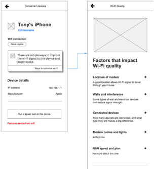
Now it was time for details, with the focus on educational content. Working closely with the team who creates troubleshooting flows, I established the key factors for strong wi-fi quality and how customers could optimise theirs with easy tweaks. Most importantly, content about the role of walls/interference in the home, competing devices on the wifi, or age of the user’s device was drafted - to reinforce that wifi quality was not just about the modem. For all of these, I sourced and streamlined existing content on Telstra’s website, drastically condensed and simplified it, then presented it to our copywriter for the final writeup and brand touches.
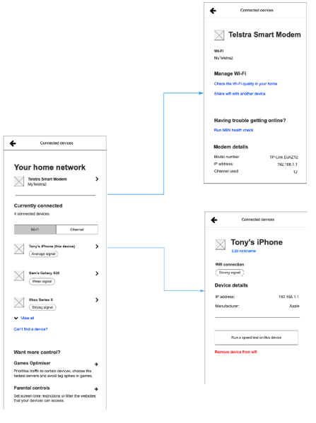
Above: the final UX wireframes, which were then turned into visual design for build
The Device List itself remained largely the same after testing [slightly pared back for MVP], but with several improvements courtesy of regular Design Critique and the expertise of our Visual Designer. Importantly, I ensured that this feature was not ‘just another option’ in the Help page, but was tightly integrated with existing features - for example within the Device List users can choose to ‘Run a speed test on this device’.
Wrapup, next steps ... and AR?
With the designs done and ready for dev, it was time to think back to the north star vision and next steps. The key theme from customer testing we had not yet tackled was representing wi-fi strength in different parts of the home. A competitor analysis revealed several augmented reality apps tackling this problem, but AR was untested with Telstra’s older consumer base. Needing to better understand if it was fit for purpose, I began brushing up on best practice from Google and Apple and compiling a set of guidelines for the Support use case.
This investigation led as far as a testable prototype, but unfortunately team changes at the company meant I was rotated to a different project before I could go any further. At the time of writing, the Speed Test and Connected Device Dashboard are still in development - and business benefit cannot yet be known. That aside, it was a fantastic experience in designing a cohesive solution and roadmap based on user insights.
Let's work together
Reach out at faris.ahmed1@live.com